0

Where do you live? - An interesting map of the world
4 years agoI've always been a map lover. Or a map geek.
Here is a map I found to be one of the most interesting ones I have seen.
It shows the population density areas with purple lines highlighting longitude and latitude where most people live. And the black zones highlight where 99% of human beings live.
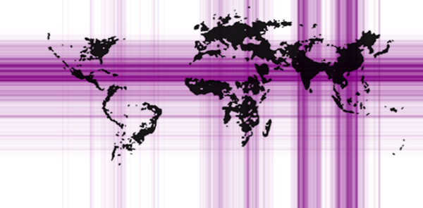
To me this map shows that the world is really big and that there are still very large areas of the earth, both land and water where there are no people.
Questions I would like to know your opinions about.
1. Where do you live?
2. Is it in a high population zone, on this map?
3. Would you like to live in a zone which has few people?
4. What do you think about this map?


